Machine Learning is learning from data and identifying the trend, pattern and insights from data in hand. It is gaining very fast popularity across the industry sectors. Machine Learning skill is an essential one nowadays to analyze a large amount of data to come up with some robust model thus enabling quick decision making and policy optimization.
Create new column from existing column in Power BI is very useful when we want to perform a particular analysis. Many times the new column requires clipping a string part from an existing column.
Such a situation I faced a few days back and was looking for a solution. And this is when I again realised the power of “Power Query“. This article is to share the same trick with you.
If you are new to Power BI, then I would suggest going through this article for a quick idea of its free version, Power BI desktop. It has numerous feature for data manipulation, transformation, visualization, report preparation etc.
Here are some popular application of Power BI as a Business Intelligence tool.
This article covers another super useful feature of Power BI. Adding a new column derived from the existing columns are very common in data analytics. It may be required as an intermediate step of data analysis or fetching some specific information.
For example, we may need only the month or day from the date column, or only the user-id from the email-id list etc.
In this article I will demonstrate the process using the data sets related to India’s state-wise crop production and rainfall data.
Lets start the process step by step and see how I have done this.
Use of “Add Column” and “Transform” options
Power BI desktop offers two options for extracting information from an existing column. Both the options namely “Add column” and “Transform” has different purposes altogether.
Create new column from existing column Power BI
Add column option adds a new column extracting the desired information from the selected column. Whereas the Transform option replaces the existing information with the extracted text.
Here our purpose is to create new column from existing column in Power BI. So let’s explore the “Add Column” feature and the options it offers.
Create new column from existing column Power BI with “Add column” option
First of all, you need to open the “Power Query Editor” by clicking “Transform data" from the Power BI desktop. Here you will get the option “Extract” under the “Add column” tab as shown in the below images.
Extracting the “Length“
This option is to fetch the length of any particular string and populate the new column. See in the below example, I have created a new column with the length of the state names from “State_Name” column.
Extracting length
The power query associated with this feature is as given below. The M language is very easy to understand. You can make necessary changes here itself if you want.
= Table.AddColumn(#"Changed Type", "Length", each Text.Length([State_Name]), Int64.Type)
Extracting the “First Characters“
If we select the “First Character” option, then as the name suggests, it extracts as many characters as we want from the start. As shown in the below image, upon clicking the option, a new window appears asking the number of characters you want to keep from the first.
As a result, the new column named “First Characters” contains the first few characters of our choice.
Extracting first characters
Extracting “Last Characters“
In the same way, we can extract the last characters as we need. See the below image, as we select the option "Last Characters", again it will prompt for the number of characters we wish to fetch from the last of the selected column.
Last characters
As we have provided 7 in the window asking the number of characters, it has extracted a matching number of characters and populated the column “Last Characters”.
Extract “Text Range“
This option offers to select strings from exact location you want. You can select starting index and number of characters from the starting index. See the bellow example where I wished to extract only the string “Nicobar”.
Keeping this in mind, I have provided 12 as the starting index and 7 as the number of characters from the 12th character. The result is the column “Text Range” has been populated with the string “Nicobar” as we wanted.
Extracting text range
Extracting using delimiters
Another very useful feature is using delimiters for extracting necessary information. It has again three options for using delimiters, which are:
Text Before Delimiter
Text After Delimiter
Text Between Delimiter
The image below demonstrates the use of the first two options. As the column “State_Name” has only one delimiter i.e. the blank space between the words, so in both the cases, I have used this delimiter only.
You can clearly observe differences between the outputs here.
Use of text before delimiters
The script for executing this operation is given below.
= Table.AddColumn(#"Removed Columns", "Text After Delimiter", each Text.AfterDelimiter([State_Name], " "), type text)
Below is the example where we need to extract text between the delimiters. The process is same as before.
Text between delimiters
The code is as below.
= Table.AddColumn(#"Inserted Text After Delimiter", "Text Between Delimiters", each Text.BetweenDelimiters([State_Name], " ", " "), type text)
Another example with different delimiters
Below is another example where you have some delimiter other than the blank space. For example one of the columns in the data table has a range of years. And the years separated with a “-“.
Now if we use this in both cases of text before and text after delimiter, the results are as in the below image.
Use of text before delimiters
Use of “Conditional Column“
This is another powerful feature of the Power BI desktop. Where we create a new column applying some conditions to another column.
For example, in the case of the agricultural data, the crop cover of different states have different percentages. And I wish to create 6 classes using these percentage values.
First, open the Power Query Editor and click the “Conditional Column” option under the “Add column” tab. You will see the window as in the below image.
The classes will be as below
Class I: crop cover with <1%
Class II: crop cover 1-2%
Class III: crop cover 2-3%
Class IV: crop cover 3-4%
Class V: crop cover 4-5% and
Class VI: crop cover >5%
See the resultant column created with the class information as we desired.
Use of conditional column
Using DAX to create new column from existing column Power BI
We can also use DAX for creating columns with substrings. The option is available under the “Table tools” in Power BI desktop. See the image below.
New column option in Power BI Desktop
Now we need to write the DAX expressions for the exact substring you want to populate the column with. See the image below, I have demonstrated few DAX for creating substring from a column values.
Comparing to the original values you can easily understand how the expressions work to extract the required information.
Creating column with substrings
Combining values of different columns
This is the last function which we will discuss in this article. Unlike fetching a part of the column values, we may need to combine the values of two columns. Such situation may arise in order to create an unique id for creating keys too.
Likewise here my purpose was to combine the state name and corresponding districts to get a unique column. I have used the COMBINEDVALUES() function of DAX to achieve the goal.
See the below image. I have demonstrated the whole process taking screenshots from my Power BI desktop.
Use of COMBINEDVALUES function
I have tried to cover the steps in a single image. The original two column values as well as the combined value columns are shown side by side so that you can compare the result.
Final words
In this blog I have covered several options available in Power BI desktop for creating new column extracting values from other columns. We frequently face such situation where we need to create such columns in order to get desired analysis results or visualization.
I hope the theory explained along with the detailed screenshots will help you understand all the steps easily. In case of any doubt please mention them in the comment below. I would like to answer them.
Different webpages are rich source of data. Either structured or unstructured, these data are very useful and can provide good insights.
Power BI has recently added and enhanced the existing feature of data extraction from the web. This feature was already compelling, with the recent enhancement it has become even more powerful.
In this article I will discuss this feature in detail with a practical example.
A practical example of web scraping with Power BI desktop
I have a data set with information on state-wise crop production in India. The data was collected from data.world. I have discussed this data and how I have analyzed it with the Power BI desktop in this article.
Now my purpose was to analyze this crop production data in context with India’s economic growth. As we know that any country’s GDP (Gross Domestic Product) and GSDP (Gross State Domestic Product) are very good indicators of its economic growth.
So we need to collect this data in order to correlate the state wise crop production with GDP and GSDP of corresponding state.
But the problem is such data is not readily available. So…..
Is web scraping an alternative option?
In this scenario, web scraping is generally the only solution.
You can read this article to know how to write web scrapers with python to collect the necessary information.
But writing a web scraper with Python needs coding knowledge. It is not possible for a person with zero knowledge in software development or at least any single programming language (preferably Python).
Add data from website to Power BI desktop
Here comes Power BI desktop with its immense powerful feature to add data directly from the website. It is really a boon for the data analysts/scientists who want this data import process smooth real smooth.
It does not require any software development background. Anyone with no idea about any programming language at all (really!!) can use it.
So without any further ado, lets jump to see how you can also do the same.
The data source
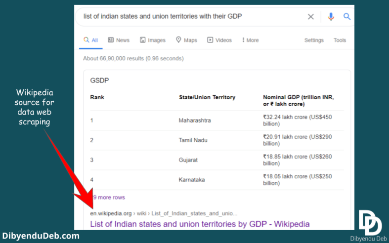
I will use an authentic website like Wikipedia for open-source data. A data source that has unquestionable authority. If you simply search Google with the search query “Indian states and union territories with their GDP”the first result you will get is from Wikipedia.
Google search result for Indian GDP
Importing the data from website to Power BI desktop
Power BI allows importing data from numerous sources as I have mentioned in the introductory article on Power BI. Among several sources, one is from “Web“.
As you can see in the below figure, you need to select the “Web” from “Get data” option under “Home” tab. Consequently, a new window will open where the URL is to be provided.
Importing data using URL of particular website
If you have already imported the data once from a website, then the address gets stored in “Recent sources“. It will help you to quickly import the data in case you need the data again to import.
“Recent source” of previously used website URL
As you provide the URL, it will first establish a connection to fetch the data. Next, a “Navigator” will open to show you a preview of the data.
See the below screenshot of the Power BI app on my computer; on the left side, all the tables from the web page will be listed. You can click the particular table you are interested and the table preview will be displayed on the right-hand side.
Navigator and table view
Similarly, if you want to get a glimpse of the web view, just click the “Web view“. A web view of the page will be displayed as shown below.
Web view of the page
Transform/load data to Power BI desktop
Now if you are satisfied and found the particular information you are looking for, proceed with the data by clicking “Load” or “Transform". I would suggest going for the transform option as it will enable you to make the necessary changes in the data.
As I have shown the data below before loading it in Power BI. With the help of Power Query,I have made minor changes like changing the column name, replacing the blank rows or replacing the “Null” values, adding necessary columns etc.
I have already described all these operations in data transformation steps here.
Window for data transformation
Once you are satisfied with the table you created, you can load it in Power BI for further processing.
Add table using examples
Another very useful feature is to "Add table using examples". As you can see this option at the bottom left corner of the window in the below screenshot.
Add table using example
This option is very helpful when the tables Power BI automatically shows do not cater to your purpose.
Suppose for the above web page you can see almost all the structured data in table form on the left pane. But you are looking for some information which is scattered on the page and not in a table form.
In that case, if you click the option “Add table using example” you will be provided with a blank table along with the web view as shown in the above image.
Upon clicking the row of the table Power BI provides several options which you can choose from to fill the table. As shown in the above image, some information with no table structure are there to populate the table.
You can also add several columns by clicking on the column header with “*”. Also change column name or later at the data transformation stage.
Final words
So, I hope this article will help you to collect required information from any web page using this feature of Power BI. It is very simple to use only you need to be aware of its existence.
My purpose was to provide you with a practical example of real world data which will make you familiar to this feature. And also to document all the steps for my future reference.
For data analysts and those who just want to get their desired data, writing web scrapers is pure time waste. I myself have written several web scrapers. It obviously has some benefits and can get you some very specific data from several webpages.
But if your data is not scattered in multiple webpages and can be fetched from specific URL, Power BI is your best friend. It will save your lots of time of collecting data and you can straight way jump to the main task of data analysis.
If you find the article helpful, please let me know commenting below. Also if you have any question regarding the topic I would love to discuss with you.
Joining tables is an important feature to combine information from several tables. We can join tables in Power BI desktop with a very nifty merging feature provided with it..
In this article, I am going to demonstrate how to join tables in Power BI desktop with some practical data. The data are all open source. You can collect them from the links provided and use them to practice.
Combining data
When it comes to combining data in tables, it can be done in two ways. One is you may need to increase the rows of a table with new data. This type of data combination is known as “Appending“.
Whereas when you add columns with new information with an existing table, it is called “Merging“.
Power BI provides both of these features under the “Home ” tab (as in the below figure). You need to use them according to your requirement.
Merge and Append queries
This particular article is on joining tables. So we are going to discuss the Merge queries option here only with suitable example.
Lets first discuss different kinds of joins. This will be an overview so that you can make the right decision while selecting join types while merging queries. Also will suggest going through the Microsoft documentation page for details.
The data set
The data set I have used for demonstration purpose is on India’s state-wise crop production collected from data. world. And another data set with India’s state-wise rainfall from different years.
Both the data set presents a real-world experience. The data is collected in raw form and refined using data transformation feature of Power BI. You can go through all the data transformation steps here.
The measures used for different calculations are described in this article.
The first table that is the crop production table contains the area under different crops in hectare (ha) respective to different districts of different Indian states. Whereas the second table i.e. the rainfall table has the rainfall record in mm respective to different districts of Indian states.
Replacing/removing errors
While importing the data from the CSV file or from the web itself, you may face some missing values. When it gets imported in Power BI, the missing values are shown as “Error“.
Now you can not proceed without handling these errors. One way is to replace these errors with proper values. It may be mean or median of rest of the values of particular variable or you can simple remove the rows with missing values.
In the below screenshot you can see how I have replaced the error with a suitable descriptive value. The “Remove errors” option will simply remove the corresponding rows.
Now suppose we want information on both the cropped area as well as rainfall of particular state and districts. Then we need to join the tables with proper conditions.
Different kinds of join tables in power bi desktop
Now Power BI will ask you about the particular join type you are interested to apply. And in order to use the correct join, we should have the idea about different joins. So here is a vivid description with examples of different joins.
For demonstration purpose I have picked few rows from both the tables and created two tables.
Left outer join
It is a prevalent joining process and the default one in Power BI, where the left or 1st table (as in the figure below) retains all of its rows and matching rows from the right or 2nd table. As the text from “Merge queries” option of Power BI displays “All from first, matching from second“.
Suppose we want to know the rainfall of some particular districts with a definite amount of cropped area. So how will you join the two tables to fetch the information? Here is left outer join to help you. See the below figure
Left outer join
In the above figure the particular information we are interested are colored as green cells. The corresponding information has the same color code in the second table.
So, as per the rule of the left outer join, all the rows (yellow coloured) of the left table and the green-coloured rows of the right table has been joined in the new table.
The Venn diagram at the bottom right corner describes the joining process in colour codes. According to this diagram, the matching rows are called the interaction of the two sets. So here the new table consists of the complete left set and the interaction of the sets.
Right outer join
Now suppose we are interested to know the information exactly opposite to what we have fetched earlier. This time we want to know the cropped area of districts having particular rainfall. So, here the right outer join we need to perform.
Right outer join of tables in Power b BI desktop
Full outer join
When we are in need of information of all the states and districts with their cropped area and rainfall, we should go for a full outer join. As the name suggests, this join will return all the records including the matching ones.
Full outer join of tables in Power BI desktop
Here is the final output from the full outer join. The rows contain both the rainfall and cropped area information including the matching rows (in green colour).
Inner join
Again if we need information on the rainfall of those districts with cropped area data as we have nothing to do with rainfall data for those districts not having any cropped area information. In this situation, the inner join produces the desired result.
See the below figure where we have applied inner join on both the tables.
Inner join of tables in Power BI desktop
See in the above image, only the matching rows are kept and all other rows have been excluded.
Left anti join
Suppose for the sake of data analysis, we need only those states and respective districts for which we don’t have any rainfall data, how can we fetch the required information?
Not to worry here the particular join type we need to apply is left anti join. Which will keep all the rows from the left table removing all those which have a match in the right table. See the below example.
Left anti join of tables in Power BI
Here in the above image we just have the required information from the left table of state wise cropped area and everything else have been excluded.
Right anti join
Now suppose we need information exactly opposite the earlier one i.e. we need only the rainfall data of all those districts for which we don’thave any information on the cropped area. The join we will apply here isright anti join.
See the below demonstration with the two tables.
Right anti join of tables in Power BI
In the above figure, the crop production tables have been joined with the rainfall table using the right anti join. You can see that all the rows of rainfall table have been retained excluding the matched rows from the crop production table.
Join tables in Power BI desktop
Now lets see a practical application of joining tables in Power BI desktop.
When you click the merge query option of Power BI desktop, you will see the first table as the active table (the selected able while clicking the merge query option).
You need to select a column from the table with unique values and can act as a key. Then a drop-down will allow to chose from the available tables. Again you have to select another column from the second table using which both the tables can be joined.
Then you need to select the particular join option from the drop-down as shown below. All the join options are available in the same sequence as we discussed above.
Join tables options in Power BI desktop
For example here in the above image, you can see I have selected column “State_name” from the table “India_statewise_crop_production” and the column “SUBDIVISION” from the second table “rainfall_India” as the key columns for joining.
Now our purpose was to keep all the crop production information with matching rainfall data of the corresponding districts. So, I opted for “Left outer join” which is also the default option. You can choose any of them as per your requirement.
Now simply click and see the operation in process.
Selecting rows from the joined table
Now the newly created column will appear in the table. You can see in the below image that the whole table is displayed as a column. So you need to select the particular column and deselect the option “Use original column as prefix“.
See in the above image, by default the complete table appears as row element in the first table. You need to select the particular columns of the table you want here.
Use of advanced editor
Use of advanced editor of Power BI allows more flexibility to change the M script itself yo make desired changes in the output. The M language is at the core of every Power BI application.
See in the below image, the option “Advanced Editor” under the “Home” tab shows the M script behind the particular application. You can tweak them to change the join type or column names etc.
Editing M script for Joining tables in Power BI desktop
Final words
So, here is all about on join tables in Power BI desktop. I have tried to cover all the basics of each kind of join with examples. So that the you can understand the logic behind the joins. And apply the right kind for your need.
Joining tables and fetching the exact information is the core of data modelling. In order to obtain a good visual representation of the Power BI report, a good data modelling is must.
I hope this article will help you to get a good grip on this very fundamental operation of Power BI. If you have queries or doubt, please comment below. I would like to answer them.
Map visualization in Power BI is a very useful feature to show location-wise values. In this article, I will demonstrate how to use this feature with a practical example.
I have used maps a lot with ArcGIS to create boundary maps and display locations as supplementary information. It certainly requires expertise and considerable time.
Being data analytics guy, I always wondered if there is any tool which will make the mapping task easier and I can focus more on the analysis part. And here comes the Map feature of Power BI to make my life easier.
This feature has been well described by the Microsoft in its Power BI help document. So no point to repeat the same thing here. Rather I will discuss the map feature with some real-world data so that you can apply the same with yours.
I will also discuss some common problems a Power BI user may face while using this feature for the first time (which I have also faced). Certain things you need to keep in mind while using the map in Power BI which are:
The data you want to map needs to be correctly geocoded. Otherwise, it will cause ambiguity while mapping the locations
The purpose of map visualization is to show the geospatial information or the distance between the locations. So, your project should have variables assigned to locations
To remove any ambiguity regarding any locations you may have to produce the latitude and longitude of locations in decimal values.
Types of Map visualization in Power BI
Power BI offers three types of Map visualizations.
A simple Map option creates a bubble map. The size of the bubble varies with the variable set in the value field.
A filled map option. It displays the area of particular locations.
The third option is to create Map using ArcGIS tool.
All these options are available in Power BI visualization pane as shown in the below image.
Different Map visualizations of Power BI
All of the above options are powered by Bing. So you need an active internet connection to use these feature. The map gets created dynamically with the help of internet.
Power BI is very much flexible in order to take location values either city name or PIN number or specific latitude or longitude.
Many a time you may face an error thrown by Power BI due to some ambiguity in the location name. For example, a state and district both have the same name( a good instance is Washington DC of US).
In such cases Power BI itself can not decide how to mark the particular location you want. And so you need to guide Power BI to mention if it is a state name or district name.
You can do that either by editing in Power query or providing specific latitude and longitude of the location.
Practical example: map visualization of crop production in India
Without much ado. Lets dive into the example where I tried this Map option to create some beautiful and informative maps.
The data I have used here contains the crop production statistics of different states of India. The data I have collected from data.world website. And it is in a very refined state. So you don’t need to do any serious transformation.
Just some removal of blank values, filtering as I have shown in this article is enough to start with. Also, I have made custom keys from the main table for the purpose of data modelling (here is the process).
The data set contains following columns
“State_Name” containing different states of India.
“District_Name” containing state-wise different districts name
“Crop_Year” has the year of production
“Season” has the particular season of crop production
“Crop” is the particular crop name
“Area_ha” this column contains a total area of under the crop in Hectare
“Production_tonnes” has a total production of the season in Tonnes
Creating the Bubble map
This is the most interesting Map visualization offered by Power BI and here we will create this map first. Bubble map is very frequently used in data analytics. The size of bubble helps us to compare the magnitude of any parameter across different locations.
Here we need to click the Map icon from the visualization pane as shown in the first image.
Then as shown in the below figure I have selected “India_states” for the location field and “Crop_productivity” for the Size field. The purpose is to show the crop productivity of different states on the map of India.
Selecting location and size for bubble in map visualization
So here is the report output. See the below screenshot of my Power BI desktop report page. Different states of India has been located with the bubbles. The bubbles are of different size and proportional to values of crop productivity.
You can see now how it has become to visually compare the crop productivity of different states of India. Which is otherwise a tough call in a table form visualization.
The bubble map with different state wise crop productivity
Changing the fields to add more information in the map visualization
Lets make little changes in the fields of the map we created. And try to add some more information. Suppose we need the district level information. We also want the map to show different states separately.
To do that we can use the field “Legend” which we have left blank earlier. See that we have added “India_states” in that field. Also this time I have replaced “Crop_productivity” with “Area_ha“.
Here I want to mention one important point. You should drag the particular field from the right pane to the left drop-down fields instead of selecting them with left click (see the figure below).
If you select them with a click then Power BI automatically assigns them field which may not lead to something you want.
Selecting the fields
See the result below. All the states are shown with different colour shades. Different districts within states have bubbles with size proportional to the cropped area. Such a map can quickly provide an overview of the crop production scenario with a glance.
You can see the “Bing” icon at the extreme bottom-left corner. It suggests that all these map functionalities are provided by Microsoft Bing. So you need to be online to create the maps.
Formatting the Map visualization in Power BI
The basic map feature has several formatting options. You have all these formatting options available under the visualization pane with a brush icon as shown in the below figure.
Format option for basic map visualization
With the help of this format option, you can change the category, data colors, bubble size, map styles, map controls and many other visual appeal of the map you created.
You can also change the themes of your map if you are using Power BI “online service”. By default the “Road” theme is applied. The other themes available to opt from are Aerial, Dark, Light and Grey scale. Power BI desktop does not have this option.
Filled map
This is another basic map visualization option where the territory of the particular location is displayed as a filled one. For example, if we apply the same criteria as we have set for the map option, then it looks like as in the below image.
To create this map I have just clicked the “Filled map” icon in the visualization selecting the existing map. And the old map has been replaced by this new filled map in the report.
Filled map visualization in Power BI
Here we can see that the selected states are simple filled with different shades as shown in the legend. The same format options are also available for filled map also. If you want some variations in its appearance other than the default one, you can apply them.
ArcGIS map visualization in Power BI
The last and third map visualization option available in Power BI is ArcGIS map. The process of creating such map is also same. You just need to select the ArcGIS option while selecting the already created filled map.
See the below image the same map with the same options has been converted to an ArcGIS map.
ArcGIS map visualization in Power BI
An ArcGIS map has some advanced features which other map visualizations do not offer. These features are as given below:
When you zoom in and zoom out in the map the clustering features
It has advanced options like drivetime and distance radii
You can have heatmap visualization
You can add reference layers from ArcGIS online repositories
Some infographics options are also available as default in the report
All these advanced features come with some limitations like:
This map visualization option is not available for Power BI report server
In case you want to publish or embed the map in the web then this map option is not visible
The custom shape options are available only if the maps are added to the ArcGIS online and publicly shared
Final words
So, we have completed all the map visualization options available with Power BI. A practical data set I have used to demonstrate all of them.
I have kept this as simple as possible and discussed all the important functions so that you do not need to waste time. Otherwise, all the first time users invariably waste a lot of valuable time looking for the correct steps.
Hope you will find the article helpful. I would appreciate if you point out any other queries regarding the topic and suggestions by commenting below. I would like to answer them and also try to improve the content further.
Measures in Power BI are really a beautiful feature. They are fast in the calculation, has the benefit of reusability. Measures can be applied to multiple tables. We create measures to obtain counts, averages, sums, ranking, percentiles, aggregating year to dates and many more handy calculations.
Measures are dynamically calculated. And most importantly it gets imported in other applications like MS Excel through its report format. A good data modelling and creating useful measures are among the core skills Power BI Pro users have.
So, in nutshell, measures in Power BI are one of the most important features you must know and use. In this article, I am going to discuss how to use them with a simple application using real-world data.
I would suggest going through this article for in-depth knowledge of Power BI measures. It is from the creator Microsoft itself. This article will give you the overview and the necessary idea about measures to apply the steps described here.
NB: Being a non-native English speaker, I always take extra care to proofread my articles with Grammarly. It is the best grammar and spellchecker available online. Read here my review of using Grammarly for more than two years.
The data set used here is the same used to demonstrate the data modelling process in Power BI. For the first time readers, a brief description of the data is given below.
The data I used here is crop production data of different states of India. This data is accessible at Data.world. This is real-world data and without any garbage.
The columns are
“State_Name” containing different states of India.
“District_Name” containing state-wise different districts name
“Crop_Year” has the year of production
“Season” has the particular season of crop production
“Crop” is the particular crop name
“Area_ha” this column contains a total area of under the crop in Hectare
“Production_tonnes” has a total production of the season in Tonnes
Use of DAX (Data Analysis Expressions) to create Measures
We use Data Analysis Expressions (DAX) in Power BI to create measures. The same DAX is used for Excel formulas. The only difference is, in Excel, DAX is applied on cells and columns whereas, in Power BI, DAX is applied on tables and columns of the data model. And they are very fast in calculations.
Implicit and explicit measures: which one you should use?
Measures are of two kind one is implicit measures which gets calculated by default and the other one is explicit measure. Now both of these measures yield the same result.
But there are subtle differences between the calculation approaches of these two. Which you should know and use accordingly.
Implicit measures are easy to calculate and you need not write any DAX expressions for it. But it has its own share of disadvantages. Which is Implicit measures are not reusable.
On the other hand, explicit measures require some knowledge of writing DAX expressions to achieve desires result. But they can be reused. Also, you can make little changes in the DAX expression you wrote to use it for other calculations.
An example of limitations of Implicit Measures is its inability to handle division by 0(zero). If there are some calculations have divisions and your data contains some zeros in the numerator, then Implicit Measures will give garbage values.
But such a situation is well handled by Explicit Measures. Where these measures through a tiny error displaying “NAN” i.e. “Not A Number”. In this way, you can understand the possible problem and can correct it.
New Measure and Quick Measure
These two are another options provided by Power BI when you need to create measures. Now again, creating a Quick Measure is easy and does not require writing DAX expressions.
Where creating New Measure needs writing few lines of DAX expressions. But it has some advantages over Quick Measures. I will discuss it with example here in a bit.
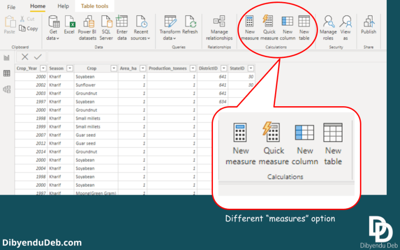
The figure below displays the options for creating “New measure”, “Quick measure”, “New column” and “New table”.
Different measures option in Power BI
While in case of “Quick measure” a wizard opens which help us to define the calculation. Again it is easy as we don’t have to bother about writing DAX at the cost of losing the flexibility and reusability offered by it.
Common mistake while creating new measure
Here I would like to mention a very common mistake while you are in the process of creating you first ever New measure. It may sound silly but related to very basic concept of measure in Power BI.
The role of a measure in Power BI is to apply some aggregate functions of the column values in the report. So, it is important to remember that measures can not be created using single row values.
See the error thrown by Power BI in the below figure when I have tried to create a new measure using single row values. My intention was to calculate productivity by dividing crop production with the area.
Common mistake while creating measures for the first time
And the error clearly directed me that a “single value” can not be determined. We need to create “New column” for that purpose.
Creating a “New column”
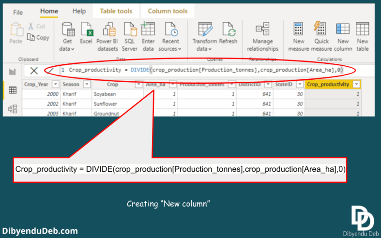
For creating a column to calculate the productivity from the crop production and area values, we will create a “New column” here. Simply click the “New column” option. A formula bar will appear where we need to write the DAX for the calculation.
Creating “New column”
Now see in the below figure where the DAX has been written for crop productivity calculation. Important to note that I have mentioned an alternate value as 0 at the end of the expression. It avoids the problem that arises whiling dividing by 0.
Creating new column with crop productivity
Creating “New measure”: an Explicit measure
While we create new measure by clicking the “New measure” option, a formula bar appears in the window. See the below figure. The “Fields” pane at the right also starts to display the Measure with a calculator icon. By default, a new measure has the name “Measure”.
Creating a “New measure”
Now we have written a DAX for calculating the average crop production. Its very simple and remember selecting the relevant table while writing the DAX. It will help you select the right column by prompting from the selected table columns.
Creating a new measure
As I have already said that explicit measures are reusable, it means that one explicit measure can be used to create another explicit measure.
Application of an Explicit measure
Use of explicit measure
Implicit measures
Here we will see how a measure can be created implicitly. It is an easier option compare to explicit measures. But it is always advisable to go for an explicit measure for its several advantages as I have discussed before.
In the below figure you can see that a bar plot has been created for the Area_ha column. By default it is the sum which is selected. You can change to other options as available in the figure.
And all these options create an implicit measure for each of them. You will not get them in the field options there. Which means that implicit measures are not reusable. Every time you want to do the same calculation, you have to go through the same process.
Creating an implicit measure
The bar plot takes only the measure “Area_ha” which gives the sum of all the cropped area from all the states. So, it gives a single bar for a single value. You can drill down further to any level adding them as values.
Like in the below image we can see that the cropped area has been displayed district wise.
Application of implicit measure
Final words
In this article, we have mainly focused on creating measures both implicit and explicit. Both measures have been shown using practical examples.
As I have discussed the merits and demerits of both the measures, it is prudent that creating explicit measures always has the edge. Implicit measures are easy to apply. That’s why any new Power BI users always prone to use the implicit measures.
Although in the long run, when he delves into more advanced use of Power BI, the data size and complexity increases, he finds that using implicit measures are not helpful in terms of their reusability.
Also, as the Explicit measures get dynamically calculated, it puts less burden on the computer memory and quick to give result.
Hope this article will help you to get a good grip and understanding on the use of measures. If you have any queries or issues regarding application of measures let me know through comments below.
I would like to address them which will enrich my knowledge too.
Data model relationships are the core of Power BI. The report preparation and visualization becomes very easy if data modelling is done well. So here in this article, we will discuss data modelling relationship with a simple example.
A common misconception among Power BI users is that Power BI is all about visualization. But that is not the case. Visualization is only the icing on the cake. Whereas the data modeling part is the cake itself.
You should give 75% of your time in data transformation and modeling. For data visualization rest 25% is enough. A good data model will enable you to dig into the data insight and to know the relationship between all the variables.
You can get a good detailed discussion on data modeling in Power BI here. The document is prepared by Microsoft itself. So no point to discuss the same thing here again. My target will be here to present you a small practical example of data modeling.
Use of multiple narrow tables
I will encourage you to use multiple narrow tables instead of a big flat table with several columns. And here lies the beauty of data modeling and relationships. Power BI can work with big wide table. But it is a kind of constrain while scaling the model.
With time your project is going to increase in size. The tables will increase in rows. Chances are there that table number will also increase as well as the complexity of your model. Fetching required information from a big table with lots of columns is time-consuming. It occupies a good amount of computer memory too.
In this scenario use of multiple tables with few columns can make your life easier.
Data model relationships in Power BI: from the Business Intelligence point of view
Business Intelligence or BI is of very critical importance in industries. Almost all businesses have a well-developed database to store all kind of transactions. Over time such databases get huge and extracting information becomes complex.
Extracting information from such big data requires experts in the field. Business houses appoint software developers to extract data, transform and load in a well-maintained data warehouse.
Creating a data warehouse is essential because no industry wants to disturb its always busy database. It may lead to jeopardies the real-time data transaction process. That’s why software developers keep their required information in a data warehouse of their own.
Now for a person without software development background it is tough to handle a data warehouse. Here comes the power of Power BI. It makes the whole ETL (Extraction, Transform and Load) process of data a cake walk for anyone with zero knowledge in software development.
A practical example of data model relationships in Power BI
Here is a simple example of how you can model relationships in Power BI. The data I used here is crop production data of different states of India. This data is accessible at Data.world. This is a real world data and without any garbage.
Data world already has provided the data in a refined manner. So, very little left for us on the part of data cleaning. And we can straight way jump into the modeling process.
Below is a glimpse of the data file imported into Power BI. This is the screenshot of the data transformation window of Power BI.
Glimpse of the crop production data
The columns are
“State_Name” containing different states of India.
“District_Name” containing state-wise different districts name
“Crop_Year” has the year of production
“Season” has the particular season of crop production
“Crop” is the particular crop name
“Area_ha” this column contains a total area of under the crop in Hectare
“Production_tonnes” has a total production of the season in Tonnes
Now this is not a very big table. Still we can reduce its size and create a custom key to further improve the data model.
Creating a custom key
Using a column to create a custom key needs selecting a variable to create a separate table. Let’s select the “District_Name” to create a new table.
Now, why should I select this column? the answer is easy this column has some redundant values. The same way the “State_Name” also does not have unique values so either of them can be selected.
We will create a separate table with this column where they will be unique with a far lesser number of rows. In this way, these tables will help us data munging, data wrangling and whatever fancy term you want to use 🙂
Trimming the column
The first step is to trim the column to remove any unwanted white spaces from the column. Just select the column in question, right-click and select transform to get the trimming option. See the below image.
Trimming the column
Removing the blank values
The second most important step is to replace any blank values. Blank values are a real problem in data analytics. Blank values can lead to spurious result as tools generally not capable to handle them. So, we should filter them out carefully in data transformation stage itself.
We can easily inspect the column quality and distribution from the view tab as shown in the below image.
Checking column quality and distribution from the view tab
So we can conclude that this particular variable is already free from any white space. See that data quality option shows “Empty as 0%”
But if your data has blank values then it is a convenient option to check it. For example, if we check the “Crop_production” variable we can see that the empty as <1%. That means it has some blank rows.
Checking for rows with “null” values
To check for the blank values we need to click the filter icon at the left of the column name. Uncheck the “Select All” option and check only the null values as shown in the above figure. Now Empty fields are 100%.
Replacing null values with 0
In order to replace the null values, you have to right click on the column name and select the “Replace Values…” option. In the new window replace the null with 0 and click OK. Now you can check the Empty has become 0% and all null values have been replaced by 0.
As no other column shows any value as Empty, so we have made our data completely free from any blank values. And we can now proceed for next step.
Creating new query and converting to table
In the next step we will create new query using the “Add as New Query” option. See the below image for the steps you should follow to create new query and then converting to a new separate table.
Creating new query and converting to new table
Removing duplicate entries
The newly created column has several duplicate entries. To make it a table with only unique entries, we need to remove the duplicates. As given in the below image, click the option “Remove Duplicates“. Now you have a column with all different districts of India.
Creating table with “District_Name”
Creating IDs for the column
It is very helpful creating a custom ID for the values in newly created column. Since the IDs are created by you, you have full control over it. Creating ID has a simple option in Power BI. See the following image to understand the steps.
Creating index column
The “Add Column” tab has options for both custom column and default column IDs starting from 0 or1. You can choose any of them. For example, here I have selected column ID starting from 0.
Merging the tables
The next step is to merge queries. As we have completed creating custom keys, now we need to merge the designated tables. See the following images to complete the tasks. Go to the “Home” tab and select “Merge Queries” option.
Selecting merge queries option
Now a “Merge” window will open and you need to verify that both the tables have exact same number of rows match. Here you can see that in both tables we have 246091 number of matching rows.
Merging the tables
Now the newly created column will appear in the table. You can see in the below image that the whole table is displayed as a column. So you need to select the particular column and deselect the option “Use original column as prefix“.
Selecting particular column from merged table
Data model relationships in Power BI: task completed
With the last step, we have completed creating a data model relationship between the two tables. You can verify that in the “Model” view of Power BI. It displays a “One to Many” relationship between the tables.
Final data model relationship
Final words
So, here is a simple example of data model relationships in Power BI with practical data. It also displays how can you create custom keys to join or merge into different tables. It is an effective way of creating a relationship as you have full control over the keys.
I hope this article will help you to start with data model relationships in Power BI with ease. In case of any doubt you can comment below. Also suggest if there any interesting topic regarding data modeling you have.
With this article, I am planning to start a series of articles over the Power BI application to solve real-world problems. So, keep visiting the website for new and interesting articles.
Microsoft’s Power BI is a very popular and most frequently used data visualization business intelligence tool. This is an introductory article on Power BI which will be followed by a series of practical problem-solving articles. So it will be “learning by doing”.
Data exploration and visualization is the most basic yet very important step in data analytics. It reveals important information to understand the data and relationships between the variables. Without a thorough understanding of these variables, we can not approach for in-depth analysis of the data.
Although there are programming tools like R and Python which are the most capable of advance data science jobs, using them for data exploration every time is tedious.
They prepare exhaustive analytics on the data with some beautiful, professional-looking charts, interactive dashboard and real-time reports really quickly. Another added advantage is collaboration with your team by publishing the report through their cloud service.
For industry leaders, it does not matter if you have created a report writing a thousand lines of codes or used a tool like Power BI. They need just a good analytics and insights from the data. So, besides tools like Python and R a data analyst should have a working knowledge of these tools too.
But why Microsoft Power BI for data visualization?
See the below figure where the different Analytics and Business Intelligence Platforms are compared with respect to two different parameters. On the X-axis it shows the completeness of vision and on the Y-axis it has the ability to execute. We can see that with respect to both these parameters, Microsoft finds its place at the top.
Analytics and Business Intelligence Platforms comparison
Increasing popularity: Google trends
Microsoft Power BI has a close competitor as Tableau analytical software for Business Intelligence. Tableau has been a popular choice of business houses since long. Compare to Tableau, Power BI came very late for public use.
Tableau made its presence in the field of business intelligence way back in 2004. Whereas Microsoft Power BI was designed by Ron George only 10 years back in 2010 and made available for public download on July,11 of 2011.
Soon after its availability, it rapidly became popular mainly because of its more affordability, user friendly interface and most importantly its compatibility with hugely popular widely used Microsoft office products.
Below is an example (Google trends) how Power BI, since its inception, gradually overtake Tableau in popularity and became the most Google-searched term in business intelligence tool in recent past.
Installation of Power BI for data visualization
I will discuss the free version of Power BI which is Power BI desktop here and you can install it from the Microsoft store itself and the process is well documented here. Just search Power BI in the windows store and click download. It will start downloading a file sized nearly 500 MB.
Below is the screenshot of my computer when the installation was complete and Power BI was ready to launch.
Power BI desktop in Microsoft store
When it is opened for the first time, you will get to see a window like below.
First screen after Power BI gets installed
Just click “get started” and you are ready to work with the Power BI. The first step is to bring the data in Power BI. Here you will get an idea why Power BI is so popular. It has the capacity to load from any kind of data source you can name.
Compatible data sources for Power BI
Power query
Power query is the most powerful feature of Power BI. It helps us clean the messy raw data. In real-world the data, we have to deal is never clean. Sometimes the data is arranged in a fashion which is only human friendly.
A human-friendly data means lots of tags and long strings within the data file for the ease of human understanding. But a machine does not have anything to do with these texts and arrangements. Rather they create problems to get read by a computer.
Power query helps to clean the data and also transform to create desired information with the available data. Below is an image showing how you can create a custom column from the columns available.
Custom column in Power BI
Query editor
So in this data transformation step, we need to convert a human-friendly data to a machine-friendly data. Don’t just click on “Load”, spend some time in data cleaning before loading it. And here comes the most powerful part of Power BI “Query editor”.
In the below image a query editor has been used to modify the data. According to your transform action, the query is built by Power BI by default. The query used the popular “M language”. You can make necessary changes in the query to get the desired result.
The syntax of the query is very easy and in case any problem a quick Google search is always helpful.
Use of query editor
You need to master the use of Power BI query editor in order to dig deep into the analysis. It is a common misconception that Power BI is only about visualization. Many Power BI users directly jump into the visualization without proper data transformation and data modelling.
But it is a wrong practice. Query editor is refered as the “Kitchen” of Power BI. The better you will able to use it the more information you can extract from the data.
Use narrow tables
A good practice for data modelling is to use narrow tables. A wider table will create a problem when you attempt some complex calculations. Always break down a wider table identifying variables which are redundant and place them in a separate table.
Using tables with lesser columns instead of wide tables
As your table size grows with time i.e. number of rows increases. And there are chances that you need to add more tables in data modelling. In both cases narrow tables will help you to create relationships with ease and fetch required data.
Create as many tables as required for analysis. And later link them using primary key and foreign keys. We will discuss this process in a separate article dedicated to data modelling.
Power query is the built-in data tool for both M.S Excel & Power BI. It helps us to transform the data as we wish in order to build a meaningful model between the dimension tables and fact tables.
Star schema: Fact tables & dimension tables
Fact tables and dimension tables are components of dimensional modelling with a star schema.
Power BI for data visualization: Star schema
Fact tables
These tables are generally long tables containing numeric values.
Dimension table
Now dimension tables are those table which generally contains information related to Who, What, Where, When and How about the fact tables. These are short tables compare to fact tables and contains mainly string variables.
Query settings
It is the particular part of Power BI data transformation window where all the magics happen. It automatically keeps track of all the data transformation steps you perform. You can go to any of these steps any time and make any kind of changes you want also replicate them further.
It kind of helps you to time travel to see the changes, how the data was cleaned and what are the data transformation steps.
DAX: Data Analytics Expressions
These are functions and operators available in Power BI which enable us to perform analytical services, building formulas, data modelling and information extraction (source: Microsoft document).
DAX functions are almost 250 in numbers used in different data transformation applications.
Measures Vs calculated columns
Implicit measures
Implicit measures are already defined measures in Power BI.
Explicit measures
These are measures defined by the Power BI user and has many benefits over the implicit measures. Explicit measures give the Power BI user more freedom, reusability and flexible applicability through connected reports.
Measures and calculated columns
Both of these options yield the same result and may appear as with the same functionalities. But it is always a good practice to use Measures over calculated columns for the reusability and flexibility of Measures.
Measures also have a plus side when you want to publish your analytical report with Excel or other applications. If you open any Power BI published file with excel, you can find the Measures you created but not Calculated columns. Hence you can reuse only the Measures not the calculated columns.
Measures make your application more light and memory friendly
Measures are being calculated dynamically and do not consume any space in the file. Hence use of measures instead of calculated columns keeps the Power BI application file very light in size even lighter than an excel file.
Use of Explicit measures also makes your data model execute very fast. You should always keep the scalability factor in mind while building models. Your model should be flexible so that it remains equally efficient with the increasing data size.
Hybrid measures
These measures are to calculate some statistics using variables from different tables. Once such measures are created they become a part of the model and can be used everywhere.
Unpivot columns
This is also a beautiful feature of Power BI. With a click it can make the rows converted to columns and vise versa in a table.
Model & relationship view
As soon as you complete your transformation/editing the data file the files are saved as Power BI files. Power BI by default identifies the relationship between the files and displays them in the Model and relationship view. You can change the model relationship and build your own.
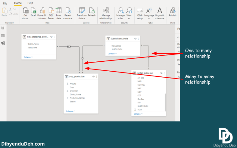
Below is an example of such modelling. A typical star schema consists of one to many relationships from dimension tables to fact tables. In this image, I have one many to many relationship also. But keep in mind you should have a clear idea of why you are creating it.
Data relationship view
This modelling part is so important. An efficient data modelling leads to easy and effecitive data analysis. A basic idea of data warehousing can be helpful here.
Once you are done with data transformation and model building, click “Close and apply” to exit the query editor.
Here we begin…
Power BI is such an interesting and powerful analytical platform and I wish to devote a complete blog category on this. As I am learning it the interest continues to grow.
It may appear overwhelming at first. With more practice, things become easier. Even you will become hungry for a more complex problem with messier data.
This is just starting off learning Power BI and here is only a glimpse of some important features. I will be covering more advanced applications in coming articles. I will update you about different analytical techniques as I learn them.
Let me know how you find this article and which topics you want to be covered in coming blogs by commenting below. Your suggestion will help me to improve the quality of articles as well as to introduce new interesting topics.
This article presents a thorough discussion on how to perform Exploratory Data Analysis (EDA) to extract meaningful insights from a data set. And to do this I am going to use Python programming language and its four very popular libraries for data handling.
EDA is considered a basic and one of the most important steps in data science. It helps us planning advance data analytics by revealing the nature of feature and target variables and their interrelationships.
Every advanced application of data science like machine learning, deep learning or artificial intelligence requires a thorough knowledge of the variables you have in your data. Without a good exploratory data analysis, you can not have that sufficient information about the variables.
In this article, we will discuss four very popular and useful libraries of Python namely Pandas, NumPy, Matplotlib and Seaborn. The first two are to handle arrays and matrices whereas the last two are for creating beautiful plots.
I have created this exploratory data analysis code file in Jupyter notebook with a common data file name and use it anytime a new data set is to be analyzed. The variable names just need to be changed. It saves my considerable time and I am thorough with all the variables with a good enough idea for further data science tasks.
NB: Being a non-native English speaker, I always take extra care to proofread my articles with Grammarly. It is the best grammar and spellchecker available online. Read here my review of using Grammarly for more than two years.
Pandas and NumPy provide us with data structures for data handling. Pandas has two main data structures called series and data frame as data container. Series contains data of mixed type in one-dimensional array whereas data frame is a two-dimensional array having columns with the same kind of data so, it can be considered as a dictionary of series.
Lets first import all the required libraries.
import pandas as pd
import numpy as np
import matplotlib.pyplot as plt
The data set used here is the very popular Titanic data set from Kaggle (https://www.kaggle.com/c/titanic/data). It contains the details of the passengers travelled in the ship and evidenced the disaster. The data frame contains 12 variables in total which are as below.
The target variable here is the ‘Survived‘ which contains the information if the passenger survived the disaster or not. It is a binary variable having ‘1’ representing the passenger has survived and ‘0’ indicating the passenger has not survived.
The other variables are all feature variables. Among the feature variables, ‘Pclass‘ contains the class information which has three classes like Upper, Middle and Lower; ‘SibSp‘ contains the number of passengers in a relationship in terms of sibling or spouse, the variable ‘Parch‘ also displays the number of relationships in terms of ‘parent‘ or ‘child‘, the ‘Embarked‘ variable displays the name of the particular port of embarkation, all other variables carry information as the variable names suggest.
Here is the shape of the data set.
df.shape
(891, 12)
It shows that the data set has 891 rows and 12 columns.
Basic information
The info() function displays some more basic information like the variable names, their variable type and if they have null values or not.
The head() function prints few starting rows of the data set for our understanding.
df.head()
Sample of the data set
Summary statistics
The describe() function prints some basic statistics of the data in hand.
df.describe()
Summary statistics
To get some idea about the non-numeric variables in the data set
df.describe(include=[bool,object])
Boolean, object count
Inspecting any particular variable more closely
df.Fare.mean()
32.2042079685746
What if we take any categorical variable for inspection? Lets consider the target variable “Survived” here. It is a binary variable as I have mentioned before.
df[df['Survived']==1].mean()
PassengerId    444.368421
Survived         1.000000
Pclass           1.950292
Age             28.343690
SibSp            0.473684
Parch            0.464912
Fare            48.395408
dtype: float64
So, it reveals important information that those who survived the disaster has an average age of 28 and they have spent on an average $48 for the fare.
Let’s find out some more critical information using logical operators. Like if we want to know what is the maximum age of a survivor travelling in Class I.
Similarly, the youngest passenger from class I was 71 years old. Such queries can retrive very interesting information.
Suppose we want to inspect the passenger details whose names start with ‘A’. Here I have used the ‘lambda‘ function for the purpose. It makes the task very easy.
Another very useful function is ‘replace()‘ from Pandas. It allows us to replace a particular value of any variable with our desired character. For example, if we want to replace the ‘Pclass‘ variable values 1,2 and 3 with ‘Class I’, ‘Class II’ and ‘Class III’ respectively then we can use the following piece of code.
This is another important function frequently used to get summary statistics. Below is an example of its application to group the variables ‘Fare‘ and ‘Age‘ with respect to the target variable ‘Survived‘.
Contingency table or cross-tabulation is a very popular technique to create a table for multivariate data set in order to display the frequency distribution of variables corresponding to other variables. Here we will use the crosstab() function of Pandas to perform the task
pd.crosstab(df['Survived'], df['Pclass'])
Contingency table
So, you can see how quickly we can get the passenger class wise tally of passenger’s survival and death count through a contingency table.
Pivot table
The ‘Pivot_table()‘ function does the job by providing a summary of some variables corresponding to any particular variable. Below is an example of how we get the mean ‘Fare‘ and ‘Age’ of all passengers either survived or died.
We can sort the data set with respect to any of the variables. For example below we have sort the data set with respect to the variable “Fare“. The parameter “ascending=False” specifies that the table will be arranged in descending order with respect to variable ‘Fare‘.
df.sort_values(by=["Fare"], ascending=False)
Sorted with respect to ‘Fare’
Visualization using different plots
Visualization is the most important part in case of performing exploratory data analysis. It reveals many interesting pattern among the variables which otherwise tough to recognise using numerals.
Here we will use two very capable python libraries called matplotlib and seaborn to create different plots and charts.
Check for missing values in the data set
A heat map created using the seaborn library is helpful to find out missing values easily. This is quite useful as if the data frame is a big one and missing values are few, locating them is not always easy. In this case, such a heatmap is quite helpful to find out missing values.
import seaborn as sns
plt.rcParams['figure.dpi'] = 100# the dpi can be set to enhance the resolution of the image
# Congiguring retina format
%config InlineBackend.figure_format = 'retina'
sns.heatmap(df.isnull(), cmap='viridis',yticklabels=False)
Heatmap to locate missing values
So, we can notice from here that out of total 12 variables, the variables “Age” and “Cabin” only have the missing values. We have used the ‘retina’ format of seaborn library to make the plot more sharp and legible.
Also, see the code to create these two plots as subplots and how the figure size has been mentioned. You can create separate plots without specifying all these details and see the effect. These specifications will help you adjust the plots and make them more legible.
Plotting the variable “Survived” to compare the dead and alive passengers of Titanic with a bar chart
sns.countplot(x=df.Survived)
Bar plot for variable ‘Survived’
The above plot displays how many people survived out of all passengers. Again if we want these comparison according to the sex of the passengers, then we should incorporate another variable in the chart.
sns.countplot(df.Survived,hue=df.Sex)
Bar plot showing the survival according to passengers’ sex
The above plot reveals an important information regarding the survival of the passengers. From the plot we have drawn before it was evident that the death was higher than the number of people survived the disaster.
Now if we group this survival according to the sex, it further reveals that the number of male passengers survived the accident was much more than that of female passengers. Also, the death count for female passengers was also higher than male passengers.
Lets inspect the same information with a contingency table
Contingency table for count of passengers survived according to their sex
Again if we want to categorize the plot of survival of the passenger depending on the class of the passengers, then we can have the information about how many passengers of a particular class have survived.
Bar plot with two categorical variables
There were three classes which have been represented as class 1,2 and 3. Let’s prepare a count plot with passenger class as the subcategory in case of survival of the passengers
sns.countplot(df.Survived, hue=df.Pclass)
Count plot for passenger class wise survival
The above plot clearly shows that the death toll was much higher in case of passenger of class 3 and class 1 passengers had the highest survival. Passengers of class 2 have almost equal no. of death and survival rate.
The highest no. of passengers were in class 3 and so the death toll too. We can see the below count plot where it is evident that class 3 has a much higher number of passengers compared to the other classes.
Again we can check the exact figure of passenger survival according to the passenger class with a contingency table too as below.
Below a seaborn distribution plot has been created with simple “distplot()” function all other parameters are set to the default one. By default, it calculates the standard normal values to display its distribution pattern.
sns.distplot(df.Age, color='red')
Distribution plot-1
If we want the original ‘Age’values to be displayed, we need to set the ‘kde’ as ‘False’.
Box plot and violin plots are also very good visualization method to determint the distribution of any variable. See the application of these two plots for the variable ‘Fare‘ below,
The whiskers in the boxplot above, display the interval of the point scatter which is (Q1−1.5⋅IQR, Q3+1.5⋅IQR) where Q1 is the first quartile, Q3 is the third quartile and IQR is the Inter Quartile range i.e. the difference between 1st and 3rd quartile.
The black dots represent outliers which are beyond the normal scatter marked by the whiskers. On the other hand the violin plot, the kernel density estimate has been displayed on both sides.
Creating a boxplot to inspect the distribution
Below is a boxplot created to see the distribution of different passenger class with respect to the fare and as expected the highest fare class is the first class. Another boxplot has been created with the same ‘Pclass‘ variable against the “Age” variable.
These two boxplots side by side let us understand the relation between passengers’ age group and their choice of classes. We can clearly see that senior passengers are more prone to spend higher and travel in higher classes.
Here we will inspect the relationship between the numerical variables using the correlation coefficient. Although the data set is not ideal to do this correlation study as it lacks numerical variables having a meaningful interrelation.
But for the sake of complete EDA steps, we will perform this correlation study with the numerical variables we have in our hand. We will produce a heatmap to display the correlation with different colour shades.
Scatter plots are very handy in displaying the relationship between two numeric variables. The scatter() function of matplotlib library does this very quick to give us the first-hand idea about the variables.
Below is a scatterplot created between the ‘Fare‘ and ‘Age‘ variables. Here the two variables are taken as Cartesian coordinates in the 2D space. But even 3D scatterplots are also possible.
plt.scatter(df['Age'], df['Fare'])
plt.title("Age Vs Fare")
plt.xlabel('Age')
plt.ylabel('Fare')
Scatter plot
Creating a scatterplot matrix
If we want a glimpse of the joint distribution and one to one scatterplots among all combinations of the variables, a scatterplot matrix can be a good solution. The pairplot() function of the seaborn library does the job for us.
Below is an example with the scatter_var variable we created before with all the numerical variables in the data set.
sns.pairplot(df[scatter_var])
Scatter plot matrix
See the above scatterplot matrix, the diagonal plots are the distribution plot for the corresponding variables while the rest of the scatterplots are for each pair of the variables.
To conclude with I will discuss a very handy and useful function from Pandas. Pandas profiling can create a summary from the data set in a jiffy.
Pandas profiling
First of all you need to install the library using the pip command.
pip install pandas-profiling
It will take some time to install all its module. Once it gets installed then to execute it run the below line of codes. The ProfileReport() function creates the EDA_report and finally an interactive HTML file is created for the user.
from pandas_profiling import ProfileReport
EDA_report = ProfileReport(df)
EDA_report.to_file(output_file='EDA.html')
It is a very helpful process to perform exploratory data analysis specially for those who does not very familiar to coding and statistical analysis and just want some basic idea about his data. The interactive report allows them to dig further to get a particular information.
Disadvantage
The main demerit of pandas profiler is it takes too much time to generate report when the data set is huge one. And many a time the practical real world data set has thousands of records. If you through the entire data set to the profiler you might get fustrated.
In this situation ideally you should use only a part of the data and generate the report. The random sample part from the whole dat set may also help you to have some idea about the variables of interest.
Conclusion
Exploratory data analysis is the key to know your data. Any data science task starts with data exploration. So, you need to be good at exploratory data analysis and it needs a lot of practice.
Although there are a lot of tools which can prepare a summary report from the data at once. Here I have also discussed Pandas profiling function which does all data exploration on your behalf. But my experience is, these are not that effective and may result in some misleading result in case the data is not filtered properly.
If you do the exploration by hand step by step, you may need to devote some more time, but in this way you become more familiar to the data. You get a good grasp about the variables which helps you in advance data science applications.
So, that’s all about exploratory data analysis using four popular python libraries. I have discussed every function with example which are generally required to explore any data set. Please let me know how you find this article and if I have missed anything here. I will certainly improve it according to your suggestions.
This article discussed two very easy fixes for this problem faced by almost all Jupyter notebook users while doing data science projects. I have faced this issue myself while working folder of Jupyter notebook, the most preferred IDE of data scientists.
Although at the start it did not seem a big problem, as you start using Jupyter on a daily basis, you want it should start from your directory of choice. It helps you being organized, all your data science files at one place.
While I searched the internet thoroughly and got many suggestions, very few of them were really helpful. And it took quite a lot of my time to figure out the process which is really helpful. I thought to write it down as a blog so that in future I don’t have to waste time again to fix the issue and so my readers.
So, without any further ado, lets jump to the solutions…
NB: Being a non-native English speaker, I always take extra care to proofread my articles with Grammarly. It is the best grammar and spellchecker available online. Read here my review of using Grammarly for more than two years.
The first and the quickest solution is to run your Jupyter notebook right from the Anaconda PowerShell. You need to just change the directory to the desired one there and run Jupyter notebook. It is that simple. See the below image
Running the jupyter notebook with anaconda powershell
Here you can see that the default working folder of Jupyter notebook was c:\user\Dibyendu as in the PowerShell. I have changed the directory to E: and simply run the command jupyter notebook. Consequently, PowerShell has run the Jupyter notebook with the start folder as mentioned.
This is very effective and changes the start folder for jupyter notebook very easily. But the problem is that this change is temporary and you have to go through this process every time you open the notebook.
To fix this problem one solution can be to create a batch file with these commands and just run this batch file while you need to work in jupyter notebook.
Creating shortcut with target as the working folder of Jupyter notebook
This solution is my favourite and I personally follow this procedure. Here the steps are explained with screenshots from my system.
You need to first locate the jupyter notebook app in your computer by right clicking the application in your menu as shown in the below image.
Jupyter notebook app in my start menu
Now navigate to the file location and select the application file like the below image. Copy the file in your desktop or any location you want a shortcut of the application.
Location the jupyter notebook application in your computer
Now right-click the application and go to the shortcut tab. The target file you can see here is mentioned as “%USERPROFILE%”, which is indeed the default installation folder for jupyter notebook. That’s why it is the default start folder for the notebook.
Property dialog for Jupyter notebook app
Now you need to replace the “%USERPROFILE%” part with the exact location of your desired directory.
Changed target folder
In the above image you can see that I have replaced the “%USERPROFILE%” with the data science folder which contains all of my data science projects. Now just click Apply and then OK. Now to open jupyter notebook click the shortcut and jupyter will open with your mentioned directory as the start folder as in the below image.
jupyter notebook with the data science folder as the start folder
So, the problem is solved. You can use this trick and create multiple shortcuts with different folders as the start folder of jupyter notebook.
Web scraping, also known as web harvesting or screen scraping or web data extraction is a way of collecting a large amount of data from the internet. In data science, especially in machine learning, the accuracy of the model is largely dependent on the amount of data you have. A large amount of data helps to train the model and make it more perfect.
Across all business domains, data plays a crucial role to decide strategies, competitor price monitoring, consumer sentiment analysis, extracting financial statements etc. Be it a small business owner or business tycoons, the market data and analytics is something they always need to keep a tab to survive the cutthroat competition. Every single decision they take towards business expansion is driven by the data.
Web scraped data collected from diverse sources enables us to get real-time analytics i.e. data gets analyzed right after the data is available. There are instances where a delayed data analysis report has no use. For example, stock price data analysis needs to be real-time for trading. Customer Relationship Management (CRM) is also an example of real-time data analytics.
Source of data
So, what is the source of such a large amount of data? Obviously the internet. There are a lot of open-source data and also web sites catering to specialised data. Generally, we visit such sites one at a time and search for the information we look for. We put our query and the required information is fetched from the server.
This process is okay until and unless we need data for a data science project. The amount of data required for a satisfactory machine learning model is huge and a single website can not cater much.
Data science projects involve projects like Natural Language Processing (NLP), Image recognition etc. which has revolutionalized artificial intelligence application towards solving our day to day needs and even critical path-breaking scientific achievements. In these cases, web scraping is the most favourite and frequently used tool by data scientists.
Web scraping in data science can be defined as the construction of a computer programme which automatically downloads, parse, organize data from the internet (source: https://www.kdnuggets.com).
Points to remember before you go for web scraping in data science
Now before you go for data scraping from any website, you must double-check if the site allows web scaping. If the website is open-source or categorically mentions that it caters data for private use then no issue. Otherwise, you can check for the robots.txt file of the site. Sometimes the site clearly mentions if they have issues with web scaping from their site.
For example, see the robots.txt file of Facebook. You can check it navigating to the link https://www.facebook.com/robots.txt. There you can see a few lines at the very beginning of the file which categorically mentions “collection of data on Facebook through automated means is prohibited unless you have express written permission from Facebook”.
Robots.txt file of Facebook.com
So, checking the robots.txt is also an effective way of checking if data scraping is at all allowed by the website you want to scrape.
Web scraping can be accomplished both using web APIs or tools like BeautifulSoup. BeautifulSoup is a class specially made for web scraping and available with bs4 package. It is a very helpful package and saves programmers a lot of time. It helps to collect data from HTML and XML files.
Let’s try a very basic web scraping code using the BeautifulSoup class of bs4 package of Python.
A practical example of data scraping
Lets take a practical example where we can scrap a data table from a webpage. We will take the URL of this page itself and try to scrape the below table. It is an imaginary example table containing the age, height and weight data of 20 random persons.
Name
Gender
Age
Height
Weight
Ramesh
Male
18
5.6
59
Dinesh
Male
23
5.0
55
Sam
Male
22
5.5
54
Dipak
Male
15
4.5
49
Rahul
Male
18
5.9
60
Rohit
Male
20
6.0
69
Debesh
Male
25
6.1
70
Deb
Male
21
5.9
56
Debarati
Female
29
5.4
54
Dipankar
Male
22
5.7
56
Smita
Female
25
5.5
60
Dilip
Male
30
4.9
49
Amit
Male
14
4.8
43
Mukesh
Male
26
5.1
50
Aasha
Female
27
4.7
51
Dibakar
Male
22
5.3
55
Manoj
Male
33
6.2
75
Vinod
Male
27
5.2
54
Jyoti
Female
22
5.9
65
An example table for data scraping
Suppose this table we want to use in our data science project. So, how we can bring the data in a usable format. This table is just an example, and usually, you will find tables with thousands of rows and the number of web pages with such tables. But the process of scraping data will be the same.
Let’s try to scrape this small table using the bs4 library of Python. It stands for BeautifulSoup version 4. The bs class defines the basic interface called by tree builders.
Importing required libraries
The two special libraries we will need here are BeautifulSoup and requests for scraping information and grabbing the URL content.
# Importing required libraries
import requests
from bs4 import BeautifulSoup as bs # defines the basic interface called by the tree builders
In this section we are importing other basic important libraries like pandas, numpy, matplotlib, seaborn etc.
# Importing other important libraries
import pandas as pd
import numpy as np
import matplotlib.pyplot as plt
import seaborn as sns
Accessing the web pages and scraping the content
To open this particular page here I used openurl function of the library urllib through its request module. And then passing the html content with the BeautifulSoup function. Don’t bother about the ‘lxml‘ part right now. You will get to know about it later on.
# Opening the particular url using openurl function
from urllib.request import urlopen
url='https://dibyendudeb.com/what-is-web-scraping-and-why-it-is-so-important-in-data-science/'
html= urlopen(url)
soup=bs(html,'lxml')
Now the BeautifulSoup has a very useful function called find_all to find all the HTML content with a particular tag. You can explore these tags from the inspect option when you do right-click on any part of a web page.
See below the images to understand the way you can identify particular HTML tag of any specific web page content.
Inspecting the HTML tag of a web page
The records of this table are with tr and td tags. Which clearly indicates that we need to apply the find_all function with these two tags.
The specific HTML content
So let’s apply find_all to get all the values with these two tags from this web page and then create string objects with them. The resultant content we have stored here in a list.
Creating list of web scraped content
# to print all rows in a table
records=soup.find_all('tr')
# creating list with the text
text_list=[]
for row in records:
  row_store=row.find_all('td')
  text_store=str(row_store) # creating a string object from the given object
  onlytext=bs(text_store,'lxml').get_text() # using BeautifulSoup method to collect the text as a list using  get_text() function
  text_list.append(onlytext)
In the next step, we need to create a data frame from this list to make the data ready for further analysis. Print the data frame to see the records of the table within the HTML tags we mentioned in the code.
But this data need to split to create separate records according to the comma-separated values. The following line of codes creates a proper shaped data structure with multiple columns.
Some more refinement here. You can notice some unwanted braces are present with the records. The following code will fix these issues.
# Removing the opening bracket from the column 0
df1[0] = df1[0].str.strip('[')
# Removing the closing bracket from the column 9
df1[4] = df1[4].str.strip(']')
df1.head(10)
Creating table header
The table has some digits as indices which need to be corrected. We need the first row values as the index values. Let’s do this change. The following few sections first separate the first row in a data frame and then concatenate them to create the final data frame with desired index values step by step.
# Storing the table headers in a variable
headers = soup.find_all('strong')
# Using BeautifulSoup again to arrange the header tags
header_list = []# creating a list of the header values
col_headers = str(headers)
header_only = bs(col_headers, "lxml").get_text()
header_list.append(header_only)
print(header_list)
After the above step, we now have an almost complete table with us. Though need some more refinement, let’s start with the first step. We need the indices as the header of the table. So, we are here renaming the columns of the data frame.
# Assigning the first row as table header
df4=df4.rename(columns=df4.iloc[0])
df4.head(10)
The web scraped data frame with new indices
You can see that the table header here has got replicated as the first record in the table, so we need to correct this problem. Lets drop the first repeated row from the data frame.
# Droping the repeated row from the data frame
df5 = df4.drop(df4.index[0])
df5.head()
The data frame view with header
So, as we have almost the final table now lets explore the basic information about the data in our hand.
df5.info()
df5.shape
Basic information about the data frame
Check for missing value
Although the table we have on this web page does not have any missing value, still to have a check and eliminating any row with missing value is a good practice. Here the dropna function does the trick for us.
# Eliminating rows with any missing value
df5 = df5.dropna(axis=0, how='any')
df5.head()
The data frame eliminating records with any missing value
If you print the columns separately, you can notice some unwanted space and braces are there with the column names. Let’s get rid of them and we are done with refining the data frame. The blank spaces in the column names are clear when we print them.
df5.columns
White spaces in the column names
These white spaces may cause problem when we refer them in the analysis process. So, we need to remove these spaces with the help of following code.
# Some more data refinement to make the dataset more perfect
df5.rename(columns={'[Name': 'Name'},inplace=True)
df5.rename(columns={' Weight]': 'Weight'},inplace=True)
df5.rename(columns={' Height': 'Height'},inplace=True)
df5.rename(columns={' Age': 'Age'},inplace=True)
df5.rename(columns={' Gender': 'Gender'},inplace=True)
print(df5.head())
So, here is the final table with the required information.
The final web scraped data in the data frame
Exploring the web scraped data
Here we will explore the basic statistics about the data. The data has two main variables “Weight” and “Height” lets get their description.
Histogram is also a good data exploration technique describing distribution of any variable. We can check if the data is normal or with some deviation.
#histogram
sns.distplot(df5['Height']);
Histogram of the variable “Height”
Relationship between the two main variables. We will plot a scatter diagram between the variables height and weight to see how they are correlated.
# Relationship between height and weight using a scatterplot technique
df5.plot.scatter(x='Height', y='Weight',ylim=(0.800000))
Thus we have completed web scraping of a table from a web page. The technique demonstrated above is applicable to all similar cases of data scraping whatever be the size of data. The data gets stored in python data frame and can be used for any kind of analysis.
Web scraping in data science from multiple web pages
Now a more complex and rather practical example of web scraping. Many times we see that the particular information we look for are scattered through more than one pages. In this case, some additional skill is required for data scraping from these pages.
Here we will take such an example from this website itself and try to scrape the titles of all the articles written. This is only one parameter that we want to collect but the information is spread through multiple pages.
Taking one parameter will keep the code less complex and easy to understand. But it is equally effective as the process of scraping data of one parameter and multiple parameters is the same.
The index page with URL https://dibyendudeb.com has a total of five pages containing the list of all the articles the website contains. So, we will navigate through all these pages, grab the article titles in a for loop and scrape the titles using BeautifulSoup method.
Importing libraries
To start with the coding the first steps are as usual importing the required libraries. Except for the regular libraries like pandas, NumPy, matplotlib and seaborn we need to import the specialized libraries for web scraping like BeautifulSoup and requests for grabbing the URL of web pages.
# Importing required libraries
from bs4 import BeautifulSoup as bs # defines the basic interface called by the tree builders
from requests import get
# Importing other important libraries
import pandas as pd
import numpy as np
import matplotlib.pyplot as plt
import seaborn as sns
Use of BeautifulSoup for web scraping in data science
Here we will try the main scraping part. The most important task we need to do here is to identify the particular HTML content tag. This is a little experience-based skill. The more you scan the HTML content of web pages more you become comfortable to identify them.
As we have mentioned before, we want to store the article titles only. So our goal is to identify the particular HTML tag which wraps the title of an article. Let’s take a look at the home page of this website https://dibyendudeb.com. Select any of the article titles, right-click and select inspect from the option. You will get a view as below.
HTML content of particular section of a web page
Here you can see the exact HTML part of the selected web page gets highlighted. It makes our task very easy to identify the particular HTML tag we need to find from the web page. Let’s scan the HTML part more closely to understand the structure of it.
The HTML section of the code we are interested
Scanning the HTML code for web scraping
The above image presents the nested HTML code with the title section. You can here identify the particular division class containing the title of the article. So, we now know which HTML tag and the class unique tag we need to find from the scraped HTML content.
Now the below line of code will grab the particular URL and stores all the required information from all the five pages in a raw form. We will scan the whole part of this code line by line and understand functions of a particular piece of code.
# Opening the particular url using openurl function
from urllib.request import urlopen
titles=[]
pages = np.arange(1, 5, 1)
for page in pages:
  #read and open url to scrape
  page = "https://dibyendudeb.com/page/" + str(page)
  html= urlopen(page)
  soup=bs(html, 'html.parser')
  topics = soup.find_all('div', attrs={'class': 'obfx-grid-col-content'})
  for container in topics:
    title=container.h1.a.text
    titles.append(title)
Creating an empty list
The titles=[] is an empty list is declared first to store the titles. Then we have created a variable called pages to hold the page numbers which are 1,2,3,4 and 5. The np.arrange takes the first value, last value and the interval we want between them.
Use of for loop
After that, we enter into a for loop which iterates through the pages to get the content from all the web pages. Now when we are storing the URLs into the page variable, we need to pass a variable which changes with the change of web pages.
Scanning multiple webpages
If we check the URL of different pages of the web site, you can notice the page no. gets associated with the URL. For example, the URL of page 2 is https://dibyendudeb.com/page/2/. Likewise, page 3 and 4 get the page no. with the URL.
Accessing the URL
So, we need to simply concatenate the page no. with the URL within the for a loop. Which has been done with the code "https://dibyendudeb.com/page/" + str(page). We need to convert the page no. into a string as it will be a part of the URL.
html= urlopen(page): With this piece of code the page contents have been stored in the variable html variable. Next, soup=bs(html, 'html.parser') the BeautifulSoup function parses the HTML content in a variable called soup.
As we now we have the parsed HTML content of all the pages, we need to find only the article titles. The process of finding the article title I have already explained above.
Use of find_all and nested for loop to populate the list
topics = soup.find_all('div', attrs={'class': 'obfx-grid-col-content'}). Here in this code, the HTML code with required attributes have been stored in the variable named topics
for container in topics:
title=container.h1.a.text
titles.append(title)
: This piece of code is another nested for loop part which scans through the content of “topics” and stores the exact title in the variable “title“. And finally, the title gets appended in the “titles" list.
With this part, we have completed the scraping part. What remains is just refining the data and creating data frame from the list. Lets first check what we have scraped from the website. We are going to print the length and the content of the variable titles.
print(len(titles))
print(titles)
The scraped content
The length is 40. Which is exactly the number of the total articles the website contains. So, we are satisfied that the code has done what we expected from it. The content also confirms it. Here are a few starting lines from the output of the print command.
40

['\n\t\t\t\t\tDeploy machine learning models: things you should know\t\t\t\t', '\n\t\t\t\t\tHow to create your first machine learning project: a comprehensive guide\t\t\t\t', '\n\t\t\t\t\tData exploration is now super easy with D-tale\t\t\t\t', '\n\t\t\t\t\tHow to set up your deep learning workstation: the most comprehensive guide\t\t\t\t', '\n\t\t\t\t\tWhy Ubuntu is the best for Deep Learning Framework?\t\t\t\t', '\n\t\t\t\t\tAn introduction to Keras: the most popular Deep Learning framework\t\t\t\t', '\n\t\t\t\t\tA detailed discussion on tensors, why it is so important in deep learning?\t\t\t\t', '\n\t\t\t\t\t ............................................................................................................... More lines
Creating data frame from the list
Web scraping in data science is incomplete unless we have a data frame of the content. So, here we create a data frame from the list titles. We give the index name of the column as “Blog title”. Some basic information and the first 10 rows of the data frame are displayed.
The web scraped data is now in a data frame. But there are some unwanted spaces with character. Let’s clean it to have more refined data set.
# Replacing unwanted characters with a blank at the end of column 9
df1["Blog title"] = df1["Blog title"].str.replace('\n\t\t\t\t\t', '')
df1["Blog title"] = df1["Blog title"].str.replace('\t\t\t\t', '')
df1.head(10)
So, here is the final data set containing titles of all the articles the web site contains. The first 10 article titles are displayed here. Congratulations!!! you have successfully completed a whole exercise of web scraping in data science. Below is a look of the final data frame.
Web scraping in data science
The below piece of code creates a comma separated file to store the data frame. You can open it in excel for further analysis.
df1.to_csv('titles.csv')
Final words
So, we have thoroughly learned all the techniques of web scraping in data science. The article presents the basic logic behind scraping any kind of data from a particular web page and also from multiple pages.
These two are the most prevalent scenarios when we want to web scrape for data science. I have used the same web site for both the example but the logic is same for any kind of source. Personally I have found these logic very useful and applied for my analysis quite a lot.
The article will help you in many ways to collect your data of interest and take an informed decision. As the use of the internet grows astronomically, the businesses become more dependent on data. This era where data is the ultimate power and you need to use it wisely to survive the competition. And in this context, web scraping of data can give you a significant competitive advantage.
So, I am hopeful that the article will also help you in your tasks for web scraping in data science. It is very useful as well as an interesting trick. Don’t just read it, copy the code and run in your machine to see the result. Apply the same with any other source and see how it works.
Finally let me know if you find the article helpful. Post if you have any questions in the comment. I will love to answer them 🙂