Different webpages are rich source of data. Either structured or unstructured, these data are very useful and can provide good insights.
Power BI has recently added and enhanced the existing feature of data extraction from the web. This feature was already compelling, with the recent enhancement it has become even more powerful.
In this article I will discuss this feature in detail with a practical example.
A practical example of web scraping with Power BI desktop
I have a data set with information on state-wise crop production in India. The data was collected from data.world. I have discussed this data and how I have analyzed it with the Power BI desktop in this article.
Now my purpose was to analyze this crop production data in context with India’s economic growth. As we know that any country’s GDP (Gross Domestic Product) and GSDP (Gross State Domestic Product) are very good indicators of its economic growth.
So we need to collect this data in order to correlate the state wise crop production with GDP and GSDP of corresponding state.
But the problem is such data is not readily available. So…..
Is web scraping an alternative option?
In this scenario, web scraping is generally the only solution.
You can read this article to know how to write web scrapers with python to collect the necessary information.
But writing a web scraper with Python needs coding knowledge. It is not possible for a person with zero knowledge in software development or at least any single programming language (preferably Python).
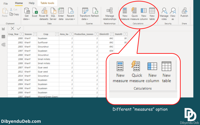
Add data from website to Power BI desktop
Here comes Power BI desktop with its immense powerful feature to add data directly from the website. It is really a boon for the data analysts/scientists who want this data import process smooth real smooth.
It does not require any software development background. Anyone with no idea about any programming language at all (really!!) can use it.
So without any further ado, lets jump to see how you can also do the same.
The data source
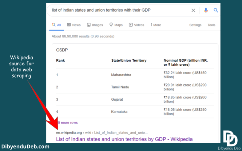
I will use an authentic website like Wikipedia for open-source data. A data source that has unquestionable authority. If you simply search Google with the search query “Indian states and union territories with their GDP” the first result you will get is from Wikipedia.
Importing the data from website to Power BI desktop
Power BI allows importing data from numerous sources as I have mentioned in the introductory article on Power BI. Among several sources, one is from “Web“.
As you can see in the below figure, you need to select the “Web” from “Get data” option under “Home” tab. Consequently, a new window will open where the URL is to be provided.

If you have already imported the data once from a website, then the address gets stored in “Recent sources“. It will help you to quickly import the data in case you need the data again to import.

As you provide the URL, it will first establish a connection to fetch the data. Next, a “Navigator” will open to show you a preview of the data.
See the below screenshot of the Power BI app on my computer; on the left side, all the tables from the web page will be listed. You can click the particular table you are interested and the table preview will be displayed on the right-hand side.

Similarly, if you want to get a glimpse of the web view, just click the “Web view“. A web view of the page will be displayed as shown below.

Transform/load data to Power BI desktop
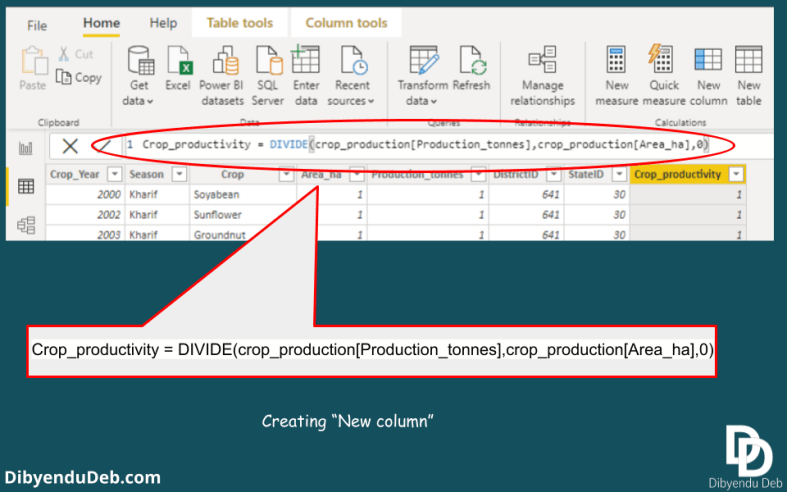
Now if you are satisfied and found the particular information you are looking for, proceed with the data by clicking “Load” or “Transform". I would suggest going for the transform option as it will enable you to make the necessary changes in the data.
As I have shown the data below before loading it in Power BI. With the help of Power Query, I have made minor changes like changing the column name, replacing the blank rows or replacing the “Null” values, adding necessary columns etc.
I have already described all these operations in data transformation steps here.

Once you are satisfied with the table you created, you can load it in Power BI for further processing.
Add table using examples
Another very useful feature is to "Add table using examples". As you can see this option at the bottom left corner of the window in the below screenshot.

This option is very helpful when the tables Power BI automatically shows do not cater to your purpose.
Suppose for the above web page you can see almost all the structured data in table form on the left pane. But you are looking for some information which is scattered on the page and not in a table form.
In that case, if you click the option “Add table using example” you will be provided with a blank table along with the web view as shown in the above image.

Upon clicking the row of the table Power BI provides several options which you can choose from to fill the table. As shown in the above image, some information with no table structure are there to populate the table.
You can also add several columns by clicking on the column header with “*”. Also change column name or later at the data transformation stage.
Final words
So, I hope this article will help you to collect required information from any web page using this feature of Power BI. It is very simple to use only you need to be aware of its existence.
My purpose was to provide you with a practical example of real world data which will make you familiar to this feature. And also to document all the steps for my future reference.
For data analysts and those who just want to get their desired data, writing web scrapers is pure time waste. I myself have written several web scrapers. It obviously has some benefits and can get you some very specific data from several webpages.
But if your data is not scattered in multiple webpages and can be fetched from specific URL, Power BI is your best friend. It will save your lots of time of collecting data and you can straight way jump to the main task of data analysis.
If you find the article helpful, please let me know commenting below. Also if you have any question regarding the topic I would love to discuss with you.