
Microsoft’s Power BI is a very popular and most frequently used data visualization business intelligence tool. This is an introductory article on Power BI which will be followed by a series of practical problem-solving articles. So it will be “learning by doing”.
Data exploration and visualization is the most basic yet very important step in data analytics. It reveals important information to understand the data and relationships between the variables. Without a thorough understanding of these variables, we can not approach for in-depth analysis of the data.
Even in data science tasks for advance application of different Machine Learning algorithms, deep learning and artificial intelligence applications, Exploratory Data Analysis (EDA) plays a very important role.
Need for data exploration tools
Although there are programming tools like R and Python which are the most capable of advance data science jobs, using them for data exploration every time is tedious.
For example, we can use Python for EDA but it takes time. In such cases tools like Microsoft Power BI, Tableau etc. comes very handy.
They prepare exhaustive analytics on the data with some beautiful, professional-looking charts, interactive dashboard and real-time reports really quickly. Another added advantage is collaboration with your team by publishing the report through their cloud service.
For industry leaders, it does not matter if you have created a report writing a thousand lines of codes or used a tool like Power BI. They need just a good analytics and insights from the data. So, besides tools like Python and R a data analyst should have a working knowledge of these tools too.
But why Microsoft Power BI for data visualization?
Gartner Inc. renowned research and advisory firm for providing information, advice and tools for different industries across the business sectors in its report on Magic Quadrant for Analytics and Business Intelligence Platforms has ranked Power BI at the top for the consecutive 13 years.
See the below figure where the different Analytics and Business Intelligence Platforms are compared with respect to two different parameters. On the X-axis it shows the completeness of vision and on the Y-axis it has the ability to execute. We can see that with respect to both these parameters, Microsoft finds its place at the top.

Increasing popularity: Google trends
Microsoft Power BI has a close competitor as Tableau analytical software for Business Intelligence. Tableau has been a popular choice of business houses since long. Compare to Tableau, Power BI came very late for public use.
Tableau made its presence in the field of business intelligence way back in 2004. Whereas Microsoft Power BI was designed by Ron George only 10 years back in 2010 and made available for public download on July,11 of 2011.
Soon after its availability, it rapidly became popular mainly because of its more affordability, user friendly interface and most importantly its compatibility with hugely popular widely used Microsoft office products.
Below is an example (Google trends) how Power BI, since its inception, gradually overtake Tableau in popularity and became the most Google-searched term in business intelligence tool in recent past.
Installation of Power BI for data visualization
I will discuss the free version of Power BI which is Power BI desktop here and you can install it from the Microsoft store itself and the process is well documented here. Just search Power BI in the windows store and click download. It will start downloading a file sized nearly 500 MB.
Below is the screenshot of my computer when the installation was complete and Power BI was ready to launch.

When it is opened for the first time, you will get to see a window like below.

Just click “get started” and you are ready to work with the Power BI. The first step is to bring the data in Power BI. Here you will get an idea why Power BI is so popular. It has the capacity to load from any kind of data source you can name.

Power query
Power query is the most powerful feature of Power BI. It helps us clean the messy raw data. In real-world the data, we have to deal is never clean. Sometimes the data is arranged in a fashion which is only human friendly.
A human-friendly data means lots of tags and long strings within the data file for the ease of human understanding. But a machine does not have anything to do with these texts and arrangements. Rather they create problems to get read by a computer.
Power query helps to clean the data and also transform to create desired information with the available data. Below is an image showing how you can create a custom column from the columns available.

Query editor
So in this data transformation step, we need to convert a human-friendly data to a machine-friendly data. Don’t just click on “Load”, spend some time in data cleaning before loading it. And here comes the most powerful part of Power BI “Query editor”.
In the below image a query editor has been used to modify the data. According to your transform action, the query is built by Power BI by default. The query used the popular “M language”. You can make necessary changes in the query to get the desired result.
The syntax of the query is very easy and in case any problem a quick Google search is always helpful.

You need to master the use of Power BI query editor in order to dig deep into the analysis. It is a common misconception that Power BI is only about visualization. Many Power BI users directly jump into the visualization without proper data transformation and data modelling.
But it is a wrong practice. Query editor is refered as the “Kitchen” of Power BI. The better you will able to use it the more information you can extract from the data.
Use narrow tables
A good practice for data modelling is to use narrow tables. A wider table will create a problem when you attempt some complex calculations. Always break down a wider table identifying variables which are redundant and place them in a separate table.

As your table size grows with time i.e. number of rows increases. And there are chances that you need to add more tables in data modelling. In both cases narrow tables will help you to create relationships with ease and fetch required data.
Create as many tables as required for analysis. And later link them using primary key and foreign keys. We will discuss this process in a separate article dedicated to data modelling.
Power query is the built-in data tool for both M.S Excel & Power BI. It helps us to transform the data as we wish in order to build a meaningful model between the dimension tables and fact tables.
Star schema: Fact tables & dimension tables
Fact tables and dimension tables are components of dimensional modelling with a star schema.

Fact tables
These tables are generally long tables containing numeric values.
Dimension table
Now dimension tables are those table which generally contains information related to Who, What, Where, When and How about the fact tables. These are short tables compare to fact tables and contains mainly string variables.
Query settings
It is the particular part of Power BI data transformation window where all the magics happen. It automatically keeps track of all the data transformation steps you perform. You can go to any of these steps any time and make any kind of changes you want also replicate them further.
It kind of helps you to time travel to see the changes, how the data was cleaned and what are the data transformation steps.
DAX: Data Analytics Expressions
These are functions and operators available in Power BI which enable us to perform analytical services, building formulas, data modelling and information extraction (source: Microsoft document).
DAX functions are almost 250 in numbers used in different data transformation applications.
Measures Vs calculated columns
Implicit measures
Implicit measures are already defined measures in Power BI.
Explicit measures
These are measures defined by the Power BI user and has many benefits over the implicit measures. Explicit measures give the Power BI user more freedom, reusability and flexible applicability through connected reports.

Both of these options yield the same result and may appear as with the same functionalities. But it is always a good practice to use Measures over calculated columns for the reusability and flexibility of Measures.
Measures also have a plus side when you want to publish your analytical report with Excel or other applications. If you open any Power BI published file with excel, you can find the Measures you created but not Calculated columns. Hence you can reuse only the Measures not the calculated columns.
Measures make your application more light and memory friendly
Measures are being calculated dynamically and do not consume any space in the file. Hence use of measures instead of calculated columns keeps the Power BI application file very light in size even lighter than an excel file.
Use of Explicit measures also makes your data model execute very fast. You should always keep the scalability factor in mind while building models. Your model should be flexible so that it remains equally efficient with the increasing data size.
Hybrid measures
These measures are to calculate some statistics using variables from different tables. Once such measures are created they become a part of the model and can be used everywhere.
Unpivot columns
This is also a beautiful feature of Power BI. With a click it can make the rows converted to columns and vise versa in a table.
Model & relationship view
As soon as you complete your transformation/editing the data file the files are saved as Power BI files. Power BI by default identifies the relationship between the files and displays them in the Model and relationship view. You can change the model relationship and build your own.
Below is an example of such modelling. A typical star schema consists of one to many relationships from dimension tables to fact tables. In this image, I have one many to many relationship also. But keep in mind you should have a clear idea of why you are creating it.
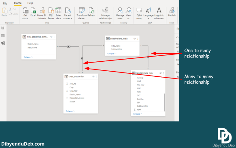
This modelling part is so important. An efficient data modelling leads to easy and effecitive data analysis. A basic idea of data warehousing can be helpful here.
Once you are done with data transformation and model building, click “Close and apply” to exit the query editor.
Here we begin…
Power BI is such an interesting and powerful analytical platform and I wish to devote a complete blog category on this. As I am learning it the interest continues to grow.
It may appear overwhelming at first. With more practice, things become easier. Even you will become hungry for a more complex problem with messier data.
This is just starting off learning Power BI and here is only a glimpse of some important features. I will be covering more advanced applications in coming articles. I will update you about different analytical techniques as I learn them.
Let me know how you find this article and which topics you want to be covered in coming blogs by commenting below. Your suggestion will help me to improve the quality of articles as well as to introduce new interesting topics.