Map visualization in Power BI is a very useful feature to show location-wise values. In this article, I will demonstrate how to use this feature with a practical example.
I have used maps a lot with ArcGIS to create boundary maps and display locations as supplementary information. It certainly requires expertise and considerable time.
Being data analytics guy, I always wondered if there is any tool which will make the mapping task easier and I can focus more on the analysis part. And here comes the Map feature of Power BI to make my life easier.
This feature has been well described by the Microsoft in its Power BI help document. So no point to repeat the same thing here. Rather I will discuss the map feature with some real-world data so that you can apply the same with yours.
I will also discuss some common problems a Power BI user may face while using this feature for the first time (which I have also faced). Certain things you need to keep in mind while using the map in Power BI which are:
- The data you want to map needs to be correctly geocoded. Otherwise, it will cause ambiguity while mapping the locations
- The purpose of map visualization is to show the geospatial information or the distance between the locations. So, your project should have variables assigned to locations
- To remove any ambiguity regarding any locations you may have to produce the latitude and longitude of locations in decimal values.
Types of Map visualization in Power BI
Power BI offers three types of Map visualizations.
- A simple Map option creates a bubble map. The size of the bubble varies with the variable set in the value field.
- A filled map option. It displays the area of particular locations.
- The third option is to create Map using ArcGIS tool.
All these options are available in Power BI visualization pane as shown in the below image.

All of the above options are powered by Bing. So you need an active internet connection to use these feature. The map gets created dynamically with the help of internet.
Power BI is very much flexible in order to take location values either city name or PIN number or specific latitude or longitude.
Many a time you may face an error thrown by Power BI due to some ambiguity in the location name. For example, a state and district both have the same name( a good instance is Washington DC of US).
In such cases Power BI itself can not decide how to mark the particular location you want. And so you need to guide Power BI to mention if it is a state name or district name.
You can do that either by editing in Power query or providing specific latitude and longitude of the location.
Practical example: map visualization of crop production in India
Without much ado. Lets dive into the example where I tried this Map option to create some beautiful and informative maps.
The data I have used here contains the crop production statistics of different states of India. The data I have collected from data.world website. And it is in a very refined state. So you don’t need to do any serious transformation.
Just some removal of blank values, filtering as I have shown in this article is enough to start with. Also, I have made custom keys from the main table for the purpose of data modelling (here is the process).
The data set contains following columns
- “State_Name” containing different states of India.
- “District_Name” containing state-wise different districts name
- “Crop_Year” has the year of production
- “Season” has the particular season of crop production
- “Crop” is the particular crop name
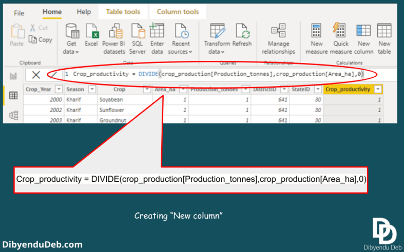
- “Area_ha” this column contains a total area of under the crop in Hectare
- “Production_tonnes” has a total production of the season in Tonnes
Creating the Bubble map
This is the most interesting Map visualization offered by Power BI and here we will create this map first. Bubble map is very frequently used in data analytics. The size of bubble helps us to compare the magnitude of any parameter across different locations.
Here we need to click the Map icon from the visualization pane as shown in the first image.
Then as shown in the below figure I have selected “India_states” for the location field and “Crop_productivity” for the Size field. The purpose is to show the crop productivity of different states on the map of India.

So here is the report output. See the below screenshot of my Power BI desktop report page. Different states of India has been located with the bubbles. The bubbles are of different size and proportional to values of crop productivity.
You can see now how it has become to visually compare the crop productivity of different states of India. Which is otherwise a tough call in a table form visualization.

Changing the fields to add more information in the map visualization
Lets make little changes in the fields of the map we created. And try to add some more information. Suppose we need the district level information. We also want the map to show different states separately.
To do that we can use the field “Legend” which we have left blank earlier. See that we have added “India_states” in that field. Also this time I have replaced “Crop_productivity” with “Area_ha“.
Here I want to mention one important point. You should drag the particular field from the right pane to the left drop-down fields instead of selecting them with left click (see the figure below).
If you select them with a click then Power BI automatically assigns them field which may not lead to something you want.

See the result below. All the states are shown with different colour shades. Different districts within states have bubbles with size proportional to the cropped area. Such a map can quickly provide an overview of the crop production scenario with a glance.

You can see the “Bing” icon at the extreme bottom-left corner. It suggests that all these map functionalities are provided by Microsoft Bing. So you need to be online to create the maps.
Formatting the Map visualization in Power BI
The basic map feature has several formatting options. You have all these formatting options available under the visualization pane with a brush icon as shown in the below figure.

With the help of this format option, you can change the category, data colors, bubble size, map styles, map controls and many other visual appeal of the map you created.
You can also change the themes of your map if you are using Power BI “online service”. By default the “Road” theme is applied. The other themes available to opt from are Aerial, Dark, Light and Grey scale. Power BI desktop does not have this option.
Filled map
This is another basic map visualization option where the territory of the particular location is displayed as a filled one. For example, if we apply the same criteria as we have set for the map option, then it looks like as in the below image.
To create this map I have just clicked the “Filled map” icon in the visualization selecting the existing map. And the old map has been replaced by this new filled map in the report.

Here we can see that the selected states are simple filled with different shades as shown in the legend. The same format options are also available for filled map also. If you want some variations in its appearance other than the default one, you can apply them.
ArcGIS map visualization in Power BI
The last and third map visualization option available in Power BI is ArcGIS map. The process of creating such map is also same. You just need to select the ArcGIS option while selecting the already created filled map.
See the below image the same map with the same options has been converted to an ArcGIS map.

An ArcGIS map has some advanced features which other map visualizations do not offer. These features are as given below:
- When you zoom in and zoom out in the map the clustering features
- It has advanced options like drivetime and distance radii
- You can have heatmap visualization
- You can add reference layers from ArcGIS online repositories
- Some infographics options are also available as default in the report
All these advanced features come with some limitations like:
- This map visualization option is not available for Power BI report server
- In case you want to publish or embed the map in the web then this map option is not visible
- The custom shape options are available only if the maps are added to the ArcGIS online and publicly shared
Final words
So, we have completed all the map visualization options available with Power BI. A practical data set I have used to demonstrate all of them.
I have kept this as simple as possible and discussed all the important functions so that you do not need to waste time. Otherwise, all the first time users invariably waste a lot of valuable time looking for the correct steps.
Hope you will find the article helpful. I would appreciate if you point out any other queries regarding the topic and suggestions by commenting below. I would like to answer them and also try to improve the content further.